
Branding & Print Collateral
Hadron Homes, Chennai
How we turned a calendar and a set of stationery into a brand statement
Gallery
Most corporate calendars are forgotten by February. They arrive with good intentions, a few glossy pages, a logo at the bottom, and then disappear into the background of office life. Stationery often suffers the same fate. A visiting card becomes a formality. A letterhead becomes a template. An envelope becomes packaging.
Hadron Homes deserved better.
As a Chennai-based real estate and infrastructure brand, Hadron Homes was building more than projects. It was building trust. Its promise — Transparent. Traceable. Trustworthy. — needed to be seen, felt and remembered in every brand touchpoint. Not just on a website. Not just on a site board. But in the quieter, more intimate places where brands truly reveal themselves: on a desk, in a meeting, in the hand of a client, and in the everyday objects people choose to keep.
That was the brief we embraced at LeverageAds.
The Challenge
To create brand collaterals for Hadron Homes that did not look like "collaterals" at all.
The objective was twofold: design a premium illustrated table calendar for 2026, and create a corporate stationery system that reflected the brand's character with clarity and restraint.
But the real task was deeper. We needed to build a branded experience that would feel unmistakably Chennai, unmistakably Hadron, and unmistakably credible.
The Insight
If Hadron Homes is shaping spaces in Chennai, then Chennai itself should become part of the brand story.
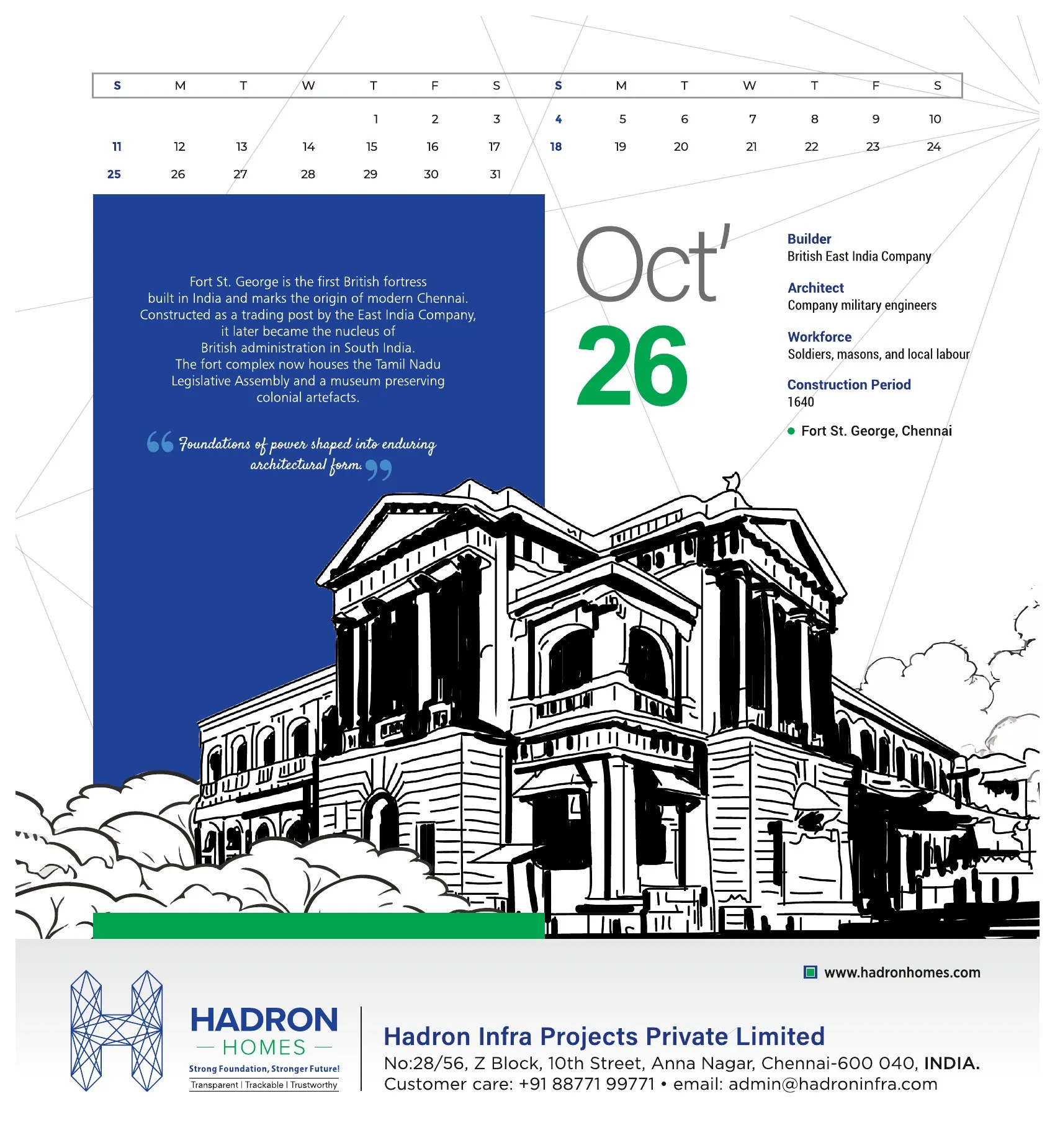
Instead of producing a routine corporate calendar filled with generic imagery, we proposed something with greater emotional and cultural weight: an illustrated table calendar inspired by the architectural marvels of Chennai. Not as decoration. As identity.
Chennai is a city of memory, structure, rhythm and contrast. Its architecture tells stories of heritage, resilience, engineering and aspiration. For a real estate brand, that language is powerful. It connects the company not just to buildings, but to the very idea of place.
So the calendar became more than a date tool. It became a year-long storytelling device — a piece of brand literature for the desk.
The Creative Approach
We treated the calendar like a collectible object, not a giveaway.
Every month was designed to celebrate the spirit of Chennai through illustration-led storytelling, with visual references rooted in the city's built environment and architectural identity. The design language balanced elegance with usability, ensuring that the calendar remained practical while still carrying the presence of a premium brand piece.
Alongside the calendar, we created a stationery suite for Hadron Homes Chennai that included business cards, letterheads and envelopes. The design system drew from the brand's geometric logo, clean layout structure and a refined blue-led palette to create a visual identity that felt modern, composed and dependable.
Nothing was overdesigned. Nothing shouted. That was the point.
In real estate branding, confidence is often expressed best through discipline. White space. Order. Typography with authority. A layout that knows when to stop. We wanted the stationery to feel like Hadron Homes itself: precise, transparent and well built.
The Result
The final output gave Hadron Homes two things every serious brand needs.
First, a distinctive Chennai-themed illustrated table calendar that stood apart from the usual corporate clutter and reinforced the company's connection to the city it serves.
Second, a premium stationery identity that elevated everyday communication into a brand experience — whether in a client meeting, an investor conversation, a vendor interaction or a project presentation.
Together, the calendar and stationery did something valuable: they made the brand tangible. Because that is what good branding does. It does not merely announce a company. It gives people a reason to remember it.
A calendar can be a calendar. A visiting card can be a visiting card. A letterhead can be just paper.
Or each of them can quietly say: this is a company with taste, thought, structure and conviction.
For Hadron Homes Chennai, we chose the second path. And that made all the difference.
Want Something Like This for Your Brand?
Book a consultation and we'll talk through what's possible for you.